Planning weeks and months with analog templates that are so simple, they’re 2-way symmetrical. Digital calendars are great analog is good for your brain.
Ben Werdmuller has. And because he knows what’s most important in helping him work more productively at home, all that other equipment falls into its proper place in the general order of things.
What I’ve taken from Ben’s short piece is this:
It’s perfectly fine to add a tasty sauce to your vegetables, as long as you understand that the veggies (not the sauce) are the mainstay of a nutritious meal.
First identify your essentials and have them firmly in place, and then think about adding your version of productivity or technology condiments.
For the past month I’ve been planning my week in both Obsidian, and on paper. For the latter I’ve designed a weekly planning page that’s so generic, it’s both vertically and horizontally symmetrical! This came about because our only functioning printer at home at the moment is a dinky little black and white Epson that can’t do double siding.
A symmetrical master has taken away the mental load (small as it was) around trying to figure out every time which way up to put the paper. It’s also forced me to greatly simplify the design, thus avoiding the millions of iterations I’ve done in the past while attempting to get each tiny detail just right.
Not that iterating is a bad thing; on the contrary! Not only is it a useful exercise in design thinking, but I can also reuse the rejects in my Paper Saver notebook. The downside for me lay in never feeling like I was done. I’d add too many details when fewer would not only have sufficed, but have been better.
And I’m finding that a simpler design is more flexible.
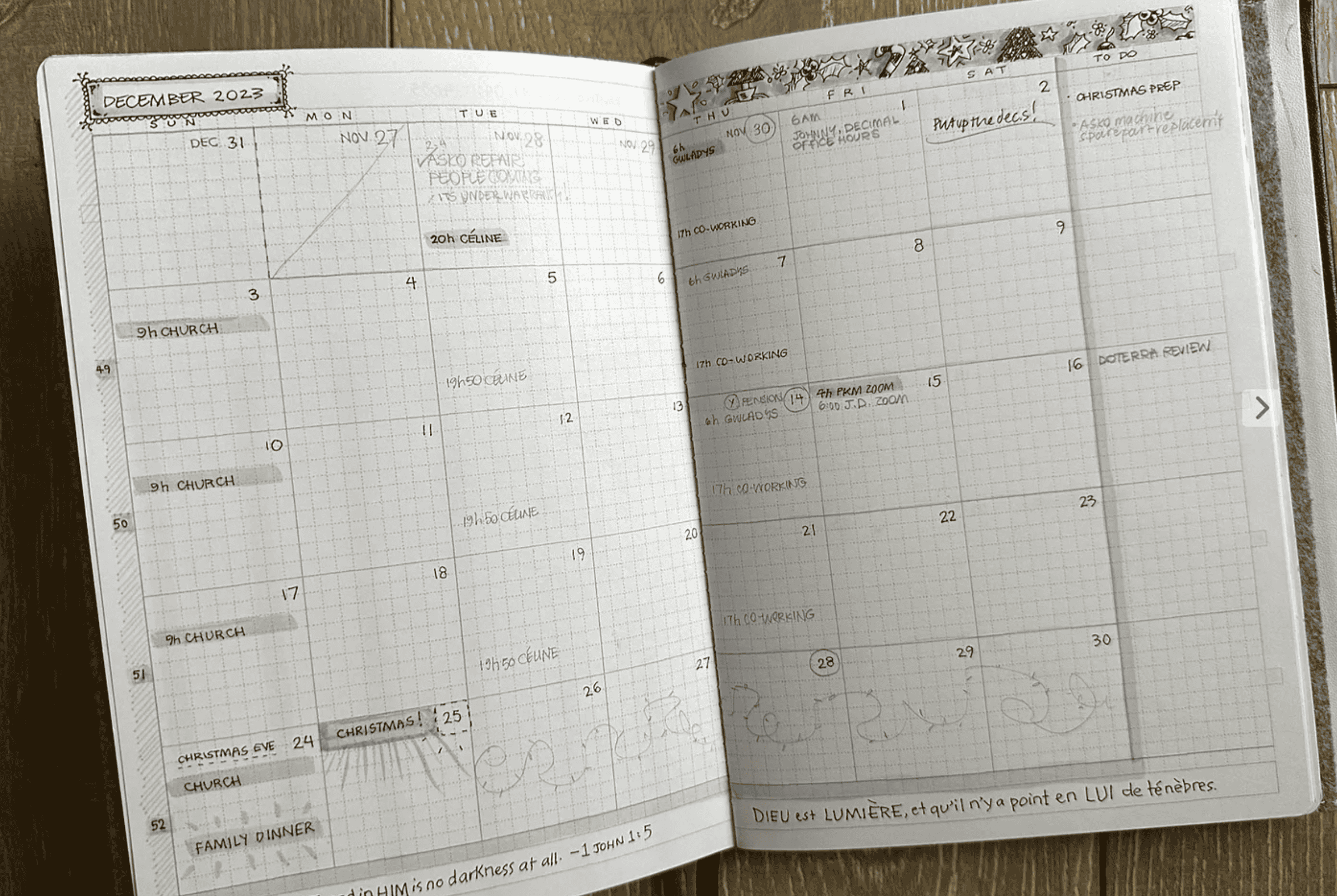
↑ The Author’s December calendar, printed on an EPSON ET-M1120, on 100 gsm smooth paper.
Handwriting the hours of the day with a freshly sharpened 2mm lead clutch pencil is a quiet delight, giving my brain space to zone out for a bit and contemplate the meaning of time itself without actually trying to do so.
The symmetrical week and month templates referenced above replace the 2023 monthly planning sheet pack I created a few months ago. Free download here.
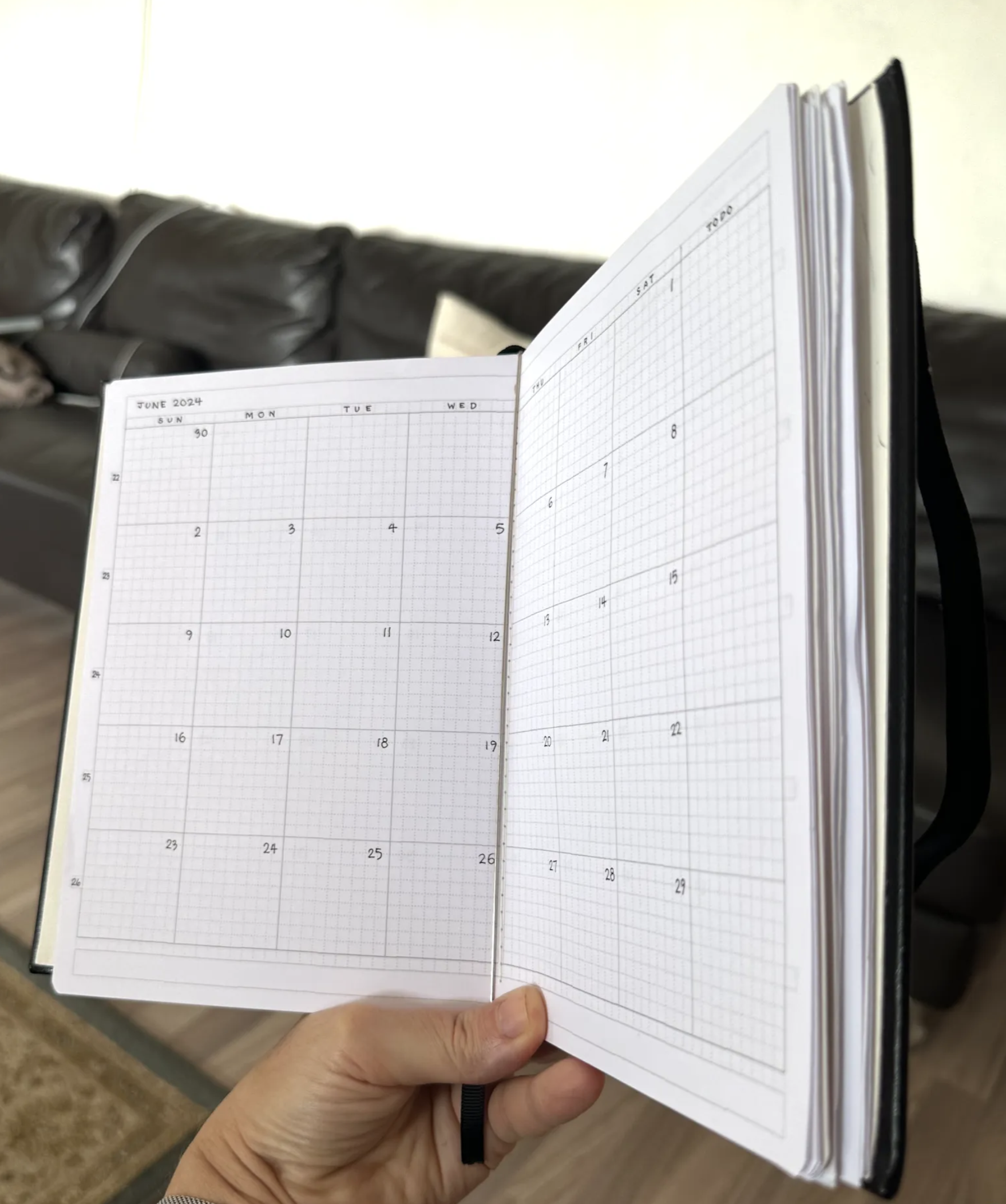
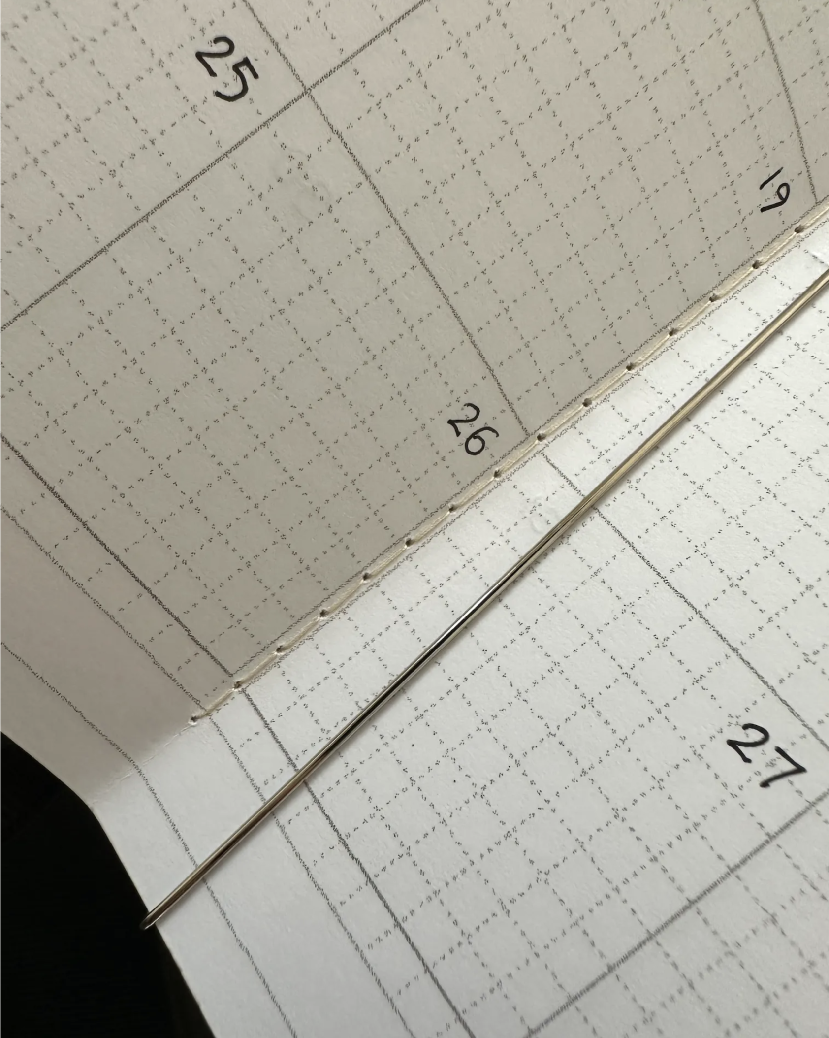
I’m keeping the pages of these planning booklets together by sewing them down the centre with the longest stitch my machine can muster. The monthly pages are sewn onto a thicker card cover. Both booklets slot into the middle of my Paper Saver, but a Lochby or Roterfaden would be easier (and more expensive) options.
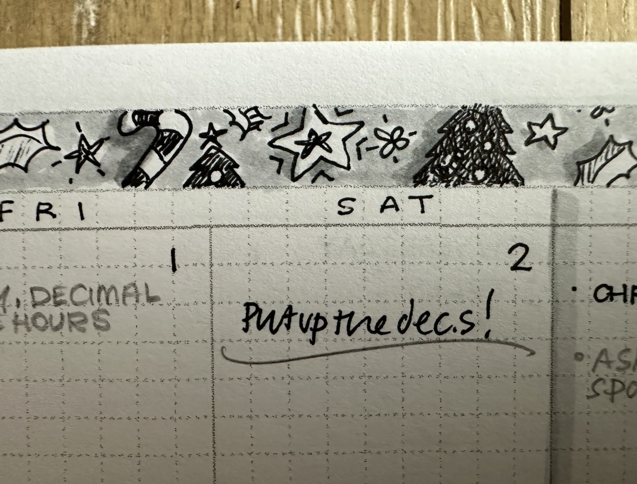
Too much colour distracts me, which is why the calendar page for December is decorated in black and grey only. This way, if I choose to add colour as the month progresses it will really pop, rather than just being more of the same.
Follow my RSS feed, or sign up to receive posts in your inbox
 PTPL 080 · Why I’m Sad That Obsidian Sync Is 100% Necessary on iOS
 PTPL 082 · Obsidian Sync Is So Good, I Bought a Keyboard For My Phone